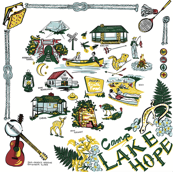
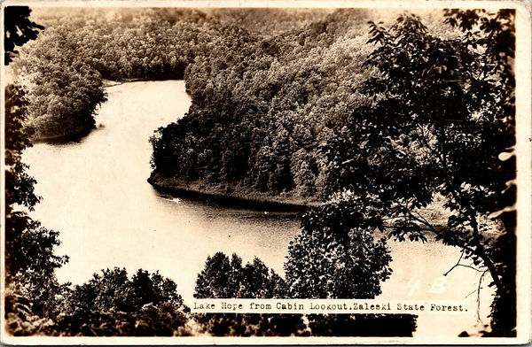
Camp Lake Hope
When my husband Sam and I were first engaged, it turned out neither of us had ever envisioned what we'd want our wedding to look like - as we talked about it, all we knew was that we wanted it to be just a really fun party for those we love, and in nature because we both feel so much peace and beauty there. One of the first traditions we ever established as a couple is going camping each summer, and so we thought this would be a perfect theme to bring all of that together!
01
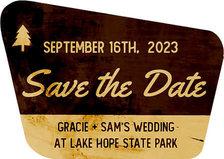
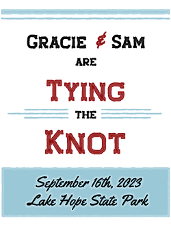
Save the date
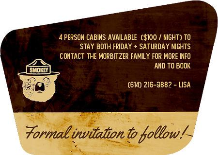
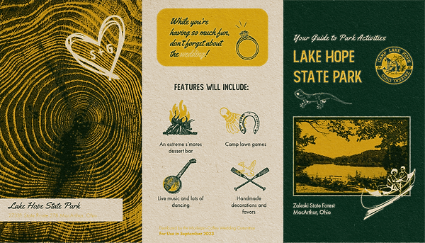
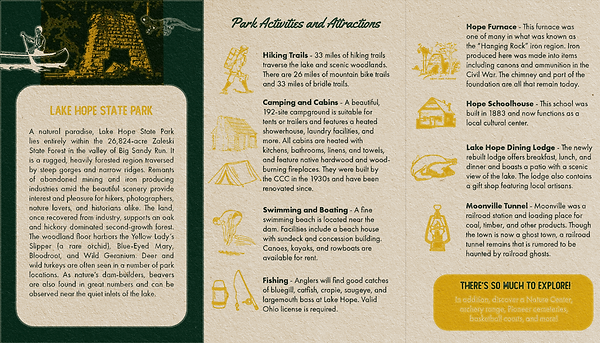
Based on the iconic National and State Park sign shapes, I designed our save-the-date to be eye catching and fun. I included a smaller piece that could be stuck in a purse or on a refrigerator, or even given to the most forgetful family member. I also included a small pamphlet about the park we chose as our venue to get folks excited about the weekend wedding in which they could also have time on their own to explore. For this piece, I used vintage fire safety pamphlets that were still being distributed at Lake Hope's wildlife center for inspiration.
Initial planning
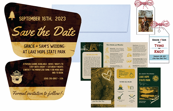
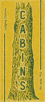
Main card
Made in Photoshop using some of my own textures as overlays. I chose the fonts Yellowtail and The Foregen to mirrior the official fonts used on these park signs.
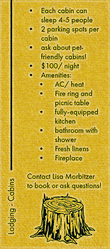
Lake hope pamphlet
This pamphlet was made in Adobe Photoshop and InDesign and rendered in True Grit Texture Supply's "Atomica" program. The colors of forest green, sunflower yellow, basic red, and a light, almost neutral blue were chosen for our theme based on my research of vintage camp ephemera and photos.
(pages out of order as this layout was used for printing)
Fridge magnet version
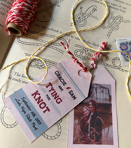
This piece was also an excuse to send out a copy of one of our engagement photos everyone was asking for! The play on words in the text also lent itself nicely to the decorative twine element reminiscent of knot-tying activities at camp. I also introduced one of our main fonts, Staincool Base, that is later used for titles and was chosen for the shape of the serifs that look like arrows. Futura, our main body text font, was used because of its association with Field Notes and like designs.


02
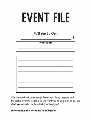
wedding party gifts + info
To ask our friends and family members to be part of our wedding party, we gave them official envelopes containing everything they might need to know, as well as some fun items like a block print I created, a paint-by-numbers, and a linen tie or pressed flower resin earrings. We included small notebooks (designed to resemble the iconic Field Notes) with tree branch pencils, and tiny compasses on the back with tags reading "You give us Direction!" We gave these out as well to some of Sam's family members who would be our musicians, hence the theme of the print.
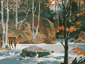
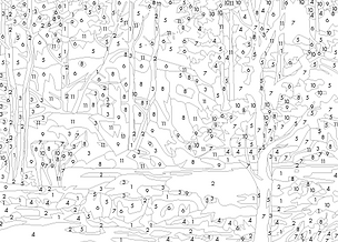
Paint by Number
I created these paint-by-number kits myself because I was so disappointed by how expensive others on the market are! I took a photo into Adobe programs to condense it down to 12 colors. Then, I used the Image Trace function to create outlines of each section of spots of color, then went back through and, assigning a number to each of the 12 colors, labeled each section. I then ordered tiny empty paint trays and mixed up each of the 12 colors for each, and send them along with the lines printed on boards and a paintbrush.

Envelopes and info pages
I made these extra simple to be able to print them on extra colorful and textured paper, and also to personalize them with my own handwriting after printing.


03
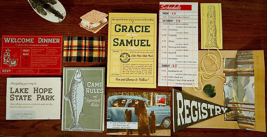
formal invitation
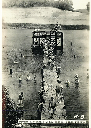
Our formal announcement was printed on linen paper, and the back is this incredible vintage photo I found of the Lake Hope Swimming area.
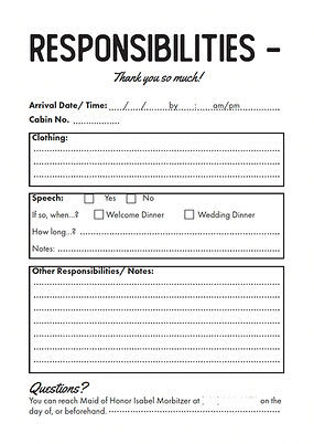
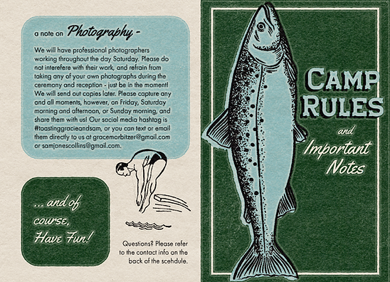
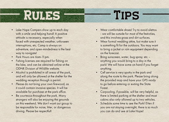
camp Rules and tips booklet
We had heard from a few less-adventurous friends that they were unsure or concerned about the idea of camping, so in our formal invitation set, we included this booklet to give them more information. We also wanted to make sure all of our guests were courteous to park staff and facilities. These pieces were again created in Adobe programs and run through the "Atomica" action. (pages out of order to accommodate booklet printing)
Other fun pieces
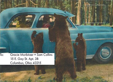
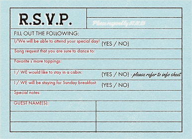
These extra papers and cards included the below items. I had the most fun creating an interior "scene" for the menu, on which I used a font with a shadow in Photoshop on the image of a vintage menu board to write out each item. I also drew out each of the maps myself, and adding a line on the RSVP cards about song requests was a great pro tip when putting together our reception playlist! Our best purchase was the envelopes that have an actual woodgrain texture from envelopes.com. I did hand-letting for the addresses, and the USPS had the prettiest woodblock wildflower stamps in almost our exact colors! We used wax seals with a fern stamp, and tied the interior bundle together with more colorful twine.
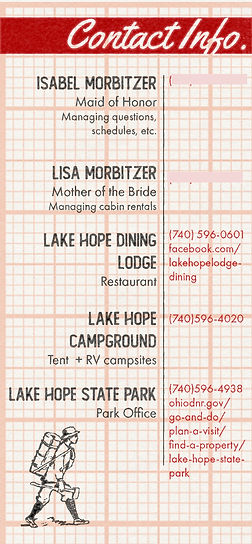
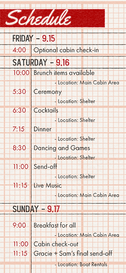
Schedule + contact numbers
pre-stamped rsvp postcards
Cabin info
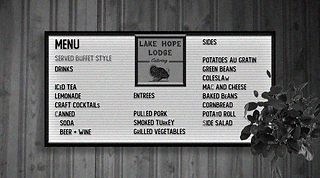
Menu
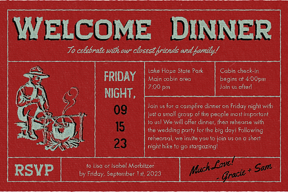
Welcome Dinner invites for the wedding party
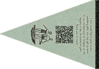
registry info
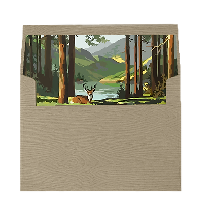
Envelope liners
stickers
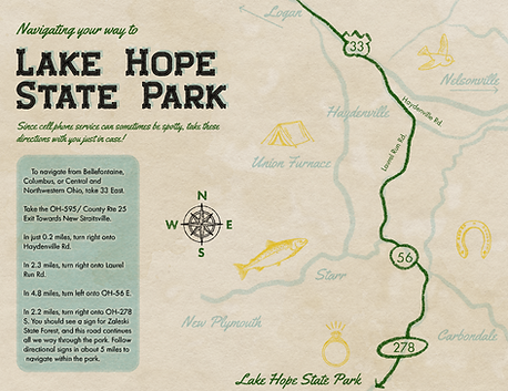
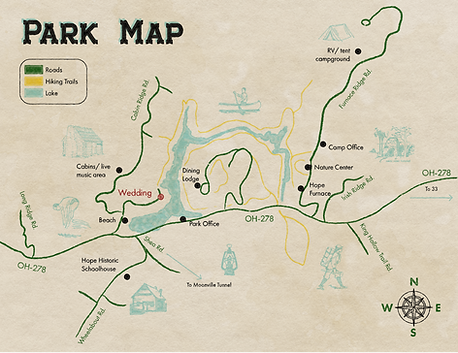
Park + Navigation maps
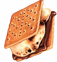
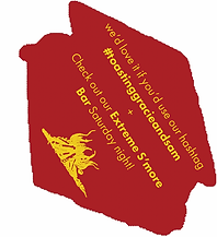
s'more cutouts with dessert info


04
screen printing
Since Sam has a background in screen printing, we opted to create camp flags this way. I designed each of these in Photoshop, and we printed them on transparent paper and burned each design into a screen. I cut and sewed felt for the flag shapes, and we screen printed onto these. We made about 12 of each design.


Bandana design
We also planned on giving away bandanas as favors with the below design 5-color screen printed on to them. I created the entire design by hand in Procreate, and separated the color layers to do so. However, two of the screens we burned did not turn out, and so instead of starting over, we decided to scrap this idea, pressed for time.
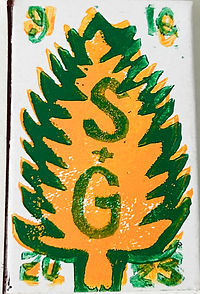
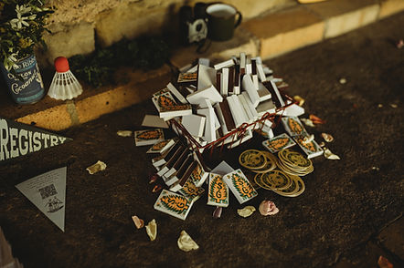
Matchboxes
Instead, I carved a 2-color block print and printed it on to matchboxes. They turned out so adorable and also were so useful for everyone staying the weekend who wanted to build their own campfires.
05
signage + decor
While thrifting was already a pretty routine hobby, I can't say I didn't enjoy the excuse to go even more frequently, picking up rusty lanterns, framed nature photos, vintage field guides, old sports equipment, and more. The few pieces we couldn't find we purchased from craft stores, and I painted myself, like the colorful archery arrows and canoe paddles. I made signage out of insulation foam in the State Park Sign shape directing guests to the cabin and wedding sites and put them throughout the park. Out of this same material, I also carved and painted a Smokey the Bear for a photo booth moment. We hung family photos on a literal tree, posted bunk assignments (with photos of my mom and sister in a ranger hat), and used a pun with my maiden name Morbitzer for our S'more bar.
My favorite piece was a large felt banner hung in the space above our shelterhouse dance floor featuring a quote from our song, "Two of us on the Run" by Lucius. I cut each letter out by hand and sewed it all together, embroidering the lower designs. We still have it hanging in our home today!


06
Flowers + Table settings
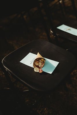
The flowers we ordered online and arranged ourselves. We chose wildflowers, and with colors as close to ours as we could get. The morning of the wedding, my mom, sister, bridesmaid and I all put together the bouquets, and filled the paper cones with flower petals (the best kind of nature-safe confetti!) which was such a beautiful moment! We even had fresh flowers on our cake by the incredible local Bad Temper Bake Shop. Our blue glasses were rented (the perfect color!!) and I sewed the table number pennants with extra fabric from our camp flags. The displays were augmented by more thrifted finds, tiny stump pieces and moss, vintage thermoses, tea lights (which were citronella - a doubly good idea!), compostable bamboo plates and silverware (with a woodgrain that also looked so much more natural and on-theme), and a badge name tag at each place setting that guests could pin to their clothing, resembling scout badges.


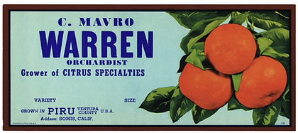
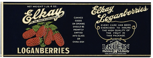
can labels
Actual vintage labels and packaging is so expensive, so to get this look, I saved all our empty cans for months, cleaned them out, and printed and pasted vintage labels on them, which can be easily found online.
07
Guest book + Activities
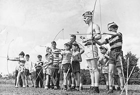
Because we wanted everyone to have their own kind of fun, we made sure there were reception activities other than dancing. We set up a craft table, had a s'more bar and bonfire, set out clipboard with instructions on how to tie knots and read star maps and trail signs, rented mini golf and archery, and of course, had sparklers as a send-off! We also had some yard games including Jenga, which, since its a tradition for my dad and I to play, was used in place of a father-daughter dance.


Guest book
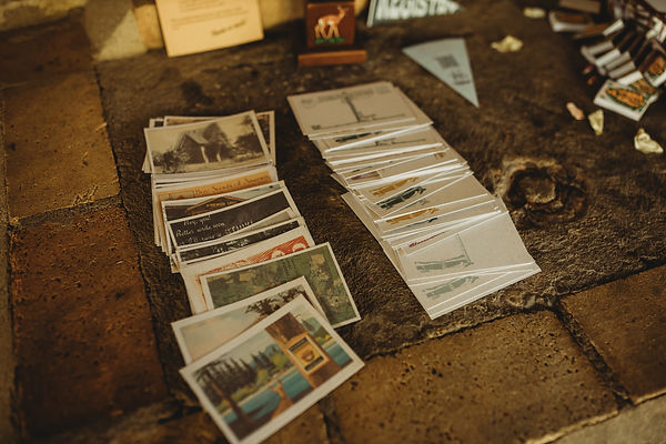
Rather than a typical bound book, we set out an assortment of postcards and asked guests to write advice, a note, or a suggestion of where we should go on our next adventure. I designed them using actual vintage postcard designs I collected, and edited the writing side to read "Camp Lake Hope".


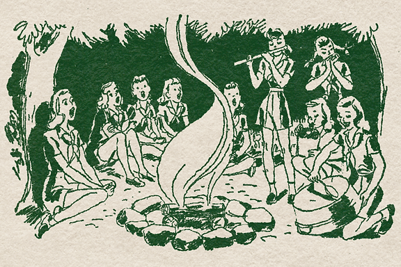
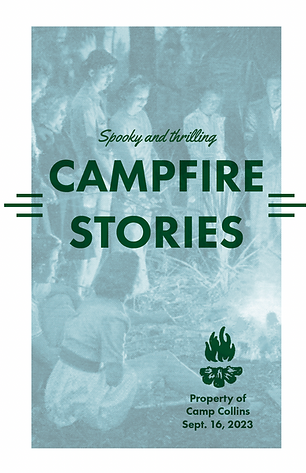
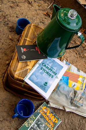
Ghost stories
Because I am such a huge ghost story fan, I made sure we had a branded collection to be read by the fire. I included classics, some by my favorite writers, and some folklore as well, editing them a bit to make them all take place right at Lake Hope. I organized them in sections from least scary to most scary, depending on the audience!
08
Extra details
Of course, the details are what make an event, and some of these projects were the most fun for me!
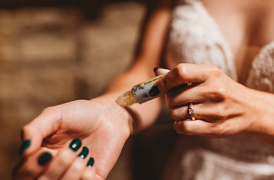
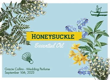
Perfume
I chose honeysuckle as my scent since those plants are all over in September anyway, and I hoped the smell of them in the future would remind me of the day. I designed my own label, since the simple scent oil tube came blank.
Wedding morning notes
Sam and I wrote notes to each other and close family members and had them delivered to their respective cabins on the morning of the wedding. This was another beautiful thing I wouldn't change, especially since we chose not to see each other until we walked down the aisle!
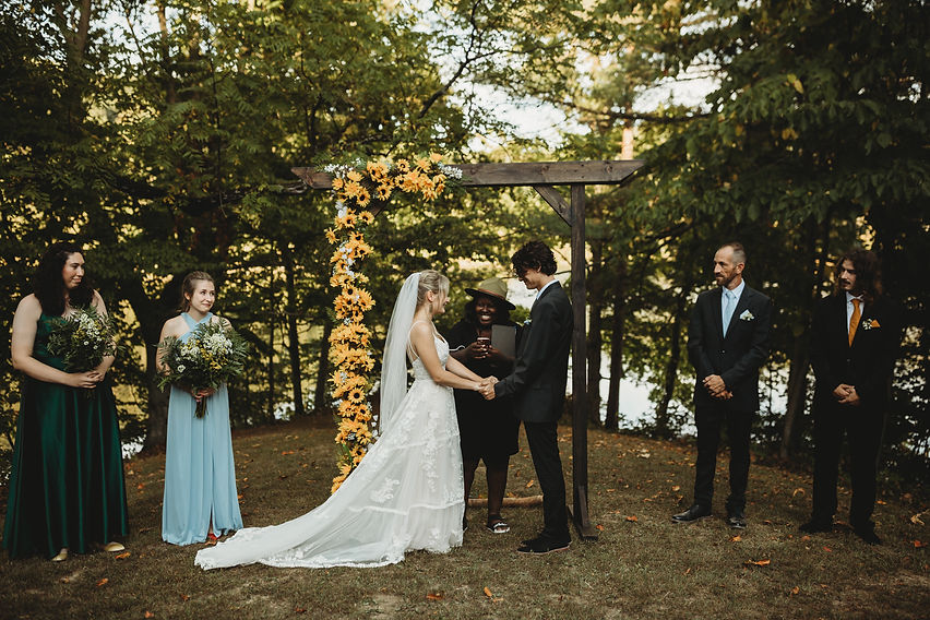
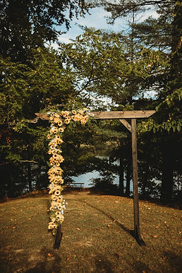
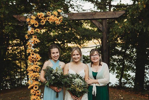
Flower Arch
Based on the design of last century campground entryways, with the help of my dad, Sam and I built and stained a wooden arch to be the centerpiece of the wedding at the end of the aisle. I stapled faux flowers up and down one side.
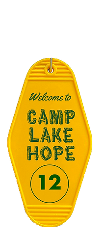
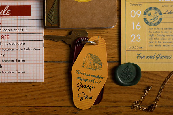
Cabin key tags
Because so many guests were staying in cabins at the state park, I designed key tags to add to their cabin keys. These turned out incredibly cute!
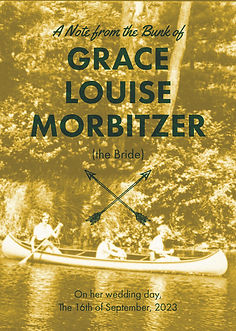
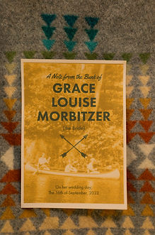
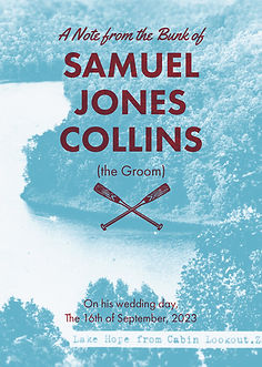
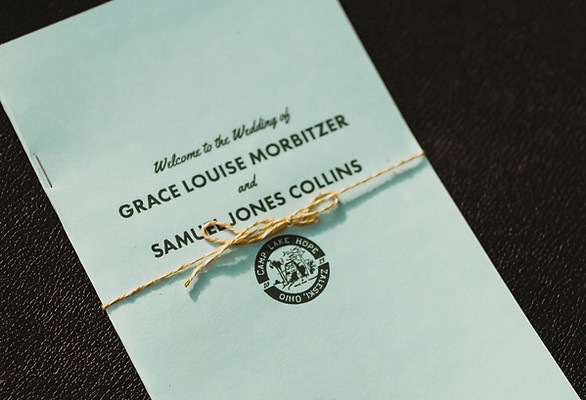
Programs
A real graphic design challenge, this had to be readable for everyone outside during the ceremony. I included photos of us camping, the names of everyone involved, and even some sheet music to make it a real camp sing-a-long!
Application is no longer available.
(scroll through the final PDF)
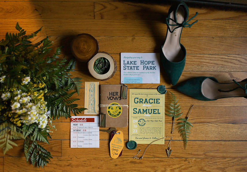
A final flatlay photo
by our incredible wedding photographer Oh Deer Photography. I wish I could share all the photos, but there are just too many!