


The Modern Saints Branding
+ Website
Social media, printed, website, and product branding for my project and small business painting saints as they may have looked if living today. It is a grungy, simple, textured theme.

.jpg)
01
Aesthetic
Our aesthetic features graffiti, strong textures, peeling paint, industrial materials, and often hidden religious references. We find this "urban decay" symbolic of religious systems and traditions that have changed and eroded over time, with beautiful pieces that can be salvaged. We also want to make a point that this faith is for the current day - the Saints are all around us now and a church is not the only place in which to live out what you believe... on your own streets is the most important place! We have to use what we have now (in our present day) for those who need our love, now!
Lastly, the Saints didn't live squeaky clean lives, despite how traditional art may make them look. They were always in the streets - sometimes in the actual dirt - with less-than-picturesque surroundings. Our faith is meant for bringing light to broken, dark, faded places.
02
Website
The neutral grungy background textures highlight the bold colors and detail of the icons. The shop and browse pages are also laid out sparsely, in gallery fashion. The site features an incredibly popular "Who is Your Patron Saint?" quiz, with over 1,000 entries per month. It also features information on historical icons, activities that can be done for groups that may be studying this project, and the story of how this project began.


03
spray paint icons
The icons are used across the website to denote quick biographical info about each saint, and they are also used on Instagram Story highlights. They are spray-paint-style reinterpretations of recognizable Christian imagery. These were created in Photoshop.
04
social posts
Each painting is posted on that saint's feast day with information about that person, and how you can celebrate by continuing the work they did. Other posts are created in a variety of formats to showcase the artistic process, the story behind certain pieces, and to highlight sales and live presentations. Some of the most fun and engaged-with posts are ones in which I continue to translate the visions and personalities of the Saints into the present day, such as imagining what sport each would play in the Olympics, using puns to create funny Valentine cards, and comparing traditional pieces in "Transformation Tuesdays". I create Saint Playlists, feature powerful quotes by saints, and share saints that are relevant to holiday or current events themes.


05
book
While the general layout of this book was decided by the team at the publisher's office, I was able to have input on the cover. The striking and bold red and yellow tones of this piece of St. Martha matched the accent colors we often use in our branding, and the plain black and white shapes have a faint texture of paint strokes.
06
incorporation of traditional art
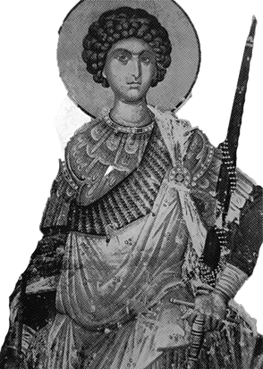
As displayed in some of the social posts in the gallery above, one of the decorative elements we like to use in our branding is black and white half-tone images of traditional icons and saint paintings. I apply the b+w and half-tone treatments myself to make it resemble a zine (an art form of info and art encompassed in cheaply printed, small, often xeroxed pages that look like this). This also goes back to our aesthetic statement. It is used most frequently in humorous contexts or to compare to my new pieces.
07


photo styling + Studio
Prints and originals are also photographed against solid color or textured backgrounds.
Our studio, located in a former porcelain factory, was chosen because it lends itself to our aesthetic as well. Exposed brick walls, paint chipping window panes, overgrown vines, and cracked concrete flooring serve as a great neutral backdrop for the bright colors of the paintings.
In the studio, I have also added window paint to be reminiscent of stained glass, furniture made of more industrial textures and colors, and benches set up like pews to face the wall of icons and red votive candles (much like a Catholic church).
08
shipping + other products
Shipping packaging and inserts, business cards, vinyl stickers, and printed marketing materials all are designed along these same rules.


09
logo + fonts
Our logo comes from the shapes of telephone poles and wires. This shape resembles a cross, especially traditional Orthodox ones that have multiple cross-bars. Our main font, Facile Sans, is bold and gallery-appropriate. Impact Label is a classic font resembling a label-maker design, which is retro, industrial, and unpretentious.